Screen Typography Compendium
Screen Typography has been around for less than 30 years and is prevalent to what we are seeing and doing, becoming part of our daily life. This compendium seeks to understand the fundamental of Screen Typography in User Interface. It is important that one must learn about the historical background of Screen Typography and what it means today. Case studies are also presented to give a concrete example on how Screen Typography are managed on the screen.
This compilation of research could lead to further explorations and research questions for the topic in the future.
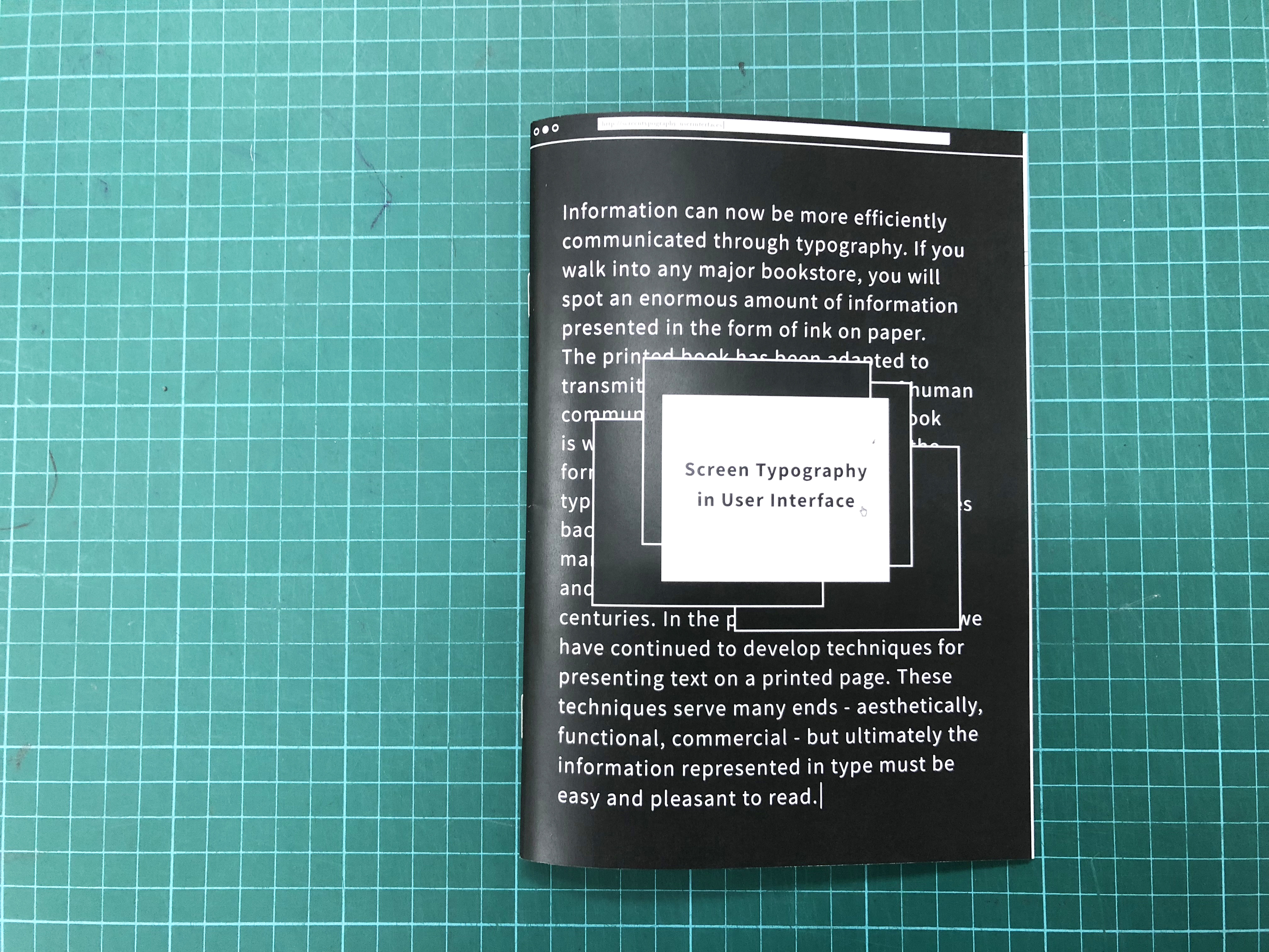
The design within the compendium uses elements of what we often see on screen, such as different windows that we use daily and cursors, the playful design of the compendium to brings out the content mentioned within it.
Font used: Sources Sans Pro (Header)
Adobe Calson Pro (Body)
Screen Typography has been around for less than 30 years and is prevalent to what we are seeing and doing, becoming part of our daily life. This compendium seeks to understand the fundamental of Screen Typography in User Interface. It is important that one must learn about the historical background of Screen Typography and what it means today. Case studies are also presented to give a concrete example on how Screen Typography are managed on the screen.
This compilation of research could lead to further explorations and research questions for the topic in the future.
The design within the compendium uses elements of what we often see on screen, such as different windows that we use daily and cursors, the playful design of the compendium to brings out the content mentioned within it.
Font used: Sources Sans Pro (Header)
Adobe Calson Pro (Body)